
Color is not decoration. It is strategy. In the world of printing and advertising, the colors you choose determine whether someone stops to look at your billboard, opens your brochure, or scrolls past your ad without a second thought. Studies show that color increases brand recognition by up to 80% and influences up to 90% of first impressions about a product. For businesses in Riyadh and across Saudi Arabia, understanding color psychology in marketing is not optional, it is the foundation of every campaign that converts. At Window Advertising Agency, with over 25 years of experience as a leading advertising agency in Riyadh, we have seen how the right color palette can transform a brand from invisible to unforgettable. This guide covers everything you need to know about color theory for advertising, from the science behind the CMYK printing system to the strategic decisions that drive purchasing behavior.
Color psychology in marketing is the study of how colors influence human emotions, perceptions, and behaviors in commercial contexts. Every color triggers a distinct psychological response. Red generates excitement and urgency. Blue communicates trust and dependability. Yellow evokes optimism and warmth. These are not arbitrary associations, they are deeply embedded patterns rooted in human biology, cultural conditioning, and decades of marketing research.
For professionals in printing and advertising, color psychology provides a scientific framework for making design decisions. Instead of choosing colors based on personal preference, experienced designers and advertising strategists use color theory to align visual elements with campaign objectives. A financial services firm in Riyadh would lean toward navy blue and silver to project stability, while a children's toy brand would use bright primaries to convey energy and playfulness.
The application of color psychology extends beyond aesthetics. It directly affects measurable business outcomes. A/B testing data consistently shows that changing the color of a call-to-action button can increase click-through rates by 20% to 30%. Packaging color influences whether a shopper picks up a product in the first three seconds of encountering it on a shelf. In outdoor advertising, high-contrast color combinations determine readability from 50 meters away versus five.
Understanding how colors affect purchasing decisions gives brands a competitive edge. When an advertising agency in Riyadh builds a campaign, color is treated as a core strategic asset, not an afterthought left to the graphic designer alone.
The use of color in commercial communication has evolved dramatically over the centuries. Ancient merchants in Middle Eastern markets used dyed fabrics and colored signage to distinguish their stalls and attract buyers. The fundamental principle, color captures attention, has remained constant even as the methods have changed.
The modern era of color in advertising began with the invention of chromolithography in the mid-19th century, which made mass-produced color printing commercially viable for the first time. Posters, packaging, and printed advertisements exploded with vibrant hues. Brands like Coca-Cola established their iconic red as early as the 1890s, proving that consistent color use builds lasting recognition.
The 20th century brought two transformative shifts. First, color television in the 1950s and 1960s required advertisers to think about color in motion. Second, the digital revolution of the 1990s introduced RGB screens and created an entirely new color environment that coexisted with traditional print. Today, a comprehensive advertising campaign must manage color across printed materials (CMYK), digital screens (RGB), and environmental installations, all while maintaining brand consistency.
In Saudi Arabia, the advertising industry has experienced rapid modernization, particularly since the Vision 2030 initiative began reshaping the commercial landscape. The demand for sophisticated visual branding in Saudi Arabia has grown substantially, and leading agencies now integrate global color science with local cultural knowledge to create campaigns that resonate with Saudi audiences.
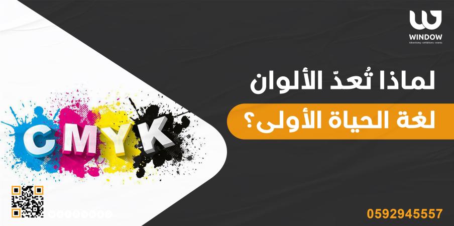
The CMYK printing system is the technical foundation of all professional color printing. Every brochure, business card, billboard, banner, and packaging you see in the physical world is produced using this system. For any business investing in printing and advertising, understanding CMYK is essential to achieving accurate and impactful results.
CMYK stands for Cyan, Magenta, Yellow, and Key (Black). It is a subtractive color model, meaning it works by absorbing (subtracting) light. When you layer cyan, magenta, and yellow inks on white paper, they absorb different wavelengths of light and reflect the colors you perceive. In theory, combining all three at full intensity produces black. In practice, the result is a muddy brown, which is why black ink (K) is added as a fourth component.
The CMYK model is the opposite of the RGB system used in digital screens, where colors are created by emitting light. This fundamental difference is why a design that looks vibrant on a computer monitor can appear dull or shifted when printed. Professional advertising agencies always design print materials in CMYK color mode from the start to avoid costly surprises during production.
| Feature | CMYK (Print) | RGB (Digital) |
|---|---|---|
| Color Model | Subtractive | Additive |
| Medium | Ink on paper/material | Light on screens |
| Primary Colors | Cyan, Magenta, Yellow, Black | Red, Green, Blue |
| Color Gamut | Narrower (fewer reproducible colors) | Wider (more vibrant range) |
| Use Case | Brochures, banners, packaging, signage | Websites, social media, video ads |
Black is designated as K (for Key) rather than B to avoid confusion with Blue. Its inclusion in the CMYK printing system serves three practical purposes. First, mixing cyan, magenta, and yellow cannot produce a true, deep black, only a dark brownish tone. Second, using a dedicated black ink is more economical than layering three inks to approximate dark tones, which consumes more ink and increases costs. Third, black ink provides sharper definition for text and fine details, which is critical in printed advertising materials where legibility determines effectiveness.
In high-quality printing and advertising production, the management of black ink, whether using rich black (a blend of all four inks) for large areas or pure black (K only) for body text, is one of the details that separates professional output from amateur work.
While standard CMYK handles most commercial printing, advanced projects sometimes require expanded color systems. Six-color printing (hexachromatic) typically adds Light Cyan and Light Magenta to produce smoother gradients, more realistic skin tones, and finer photographic detail. This is common in high-end catalog printing and premium packaging.
Eight-color printing goes further by adding Orange and Green (or Violet), significantly expanding the reproducible color gamut. This system is used for luxury brand materials, fine art reproduction, and premium advertising collateral where color precision is non-negotiable.
Additionally, Pantone (PMS) spot colors are used when absolute color consistency is required, for example, reproducing an exact brand color across thousands of printed items. Major brands specify Pantone codes for their brand identity colors to ensure uniformity, whether materials are printed in Riyadh, Dubai, or London.
Industry Insight: Approximately 85% of commercial advertising materials in Saudi Arabia are produced using standard 4-color CMYK printing. The remaining 15%, typically for luxury, automotive, and premium retail clients, use expanded color systems or Pantone spot colors for enhanced fidelity.
Colors influence purchasing decisions through both instinctive emotional responses and learned cultural associations. Research from the Institute for Color Research indicates that people form a subconscious judgment about a product within 90 seconds of initial viewing, and between 62% and 90% of that assessment is based on color alone. This makes color the single most powerful visual element in any advertising or retail environment.
Here is how specific colors affect consumer behavior in marketing contexts:
Red: Creates urgency, stimulates appetite. Increases heart rate. Used in clearance sales, food brands, and CTAs.
Blue: Builds trust, conveys security. Preferred by banks, tech companies, and healthcare providers.
Green: Signals health, nature, and growth. Strong cultural resonance in Saudi Arabia. Used in eco-brands and finance.
Gold / Yellow: Evokes optimism and prestige. Gold signals luxury in the Saudi market. Yellow attracts window shoppers.
Purple: Associated with royalty, creativity, and wisdom. Effective for beauty, luxury, and premium products.
Black: Communicates sophistication and exclusivity. Dominant in luxury branding, fashion, and high-end electronics.
In the Saudi Arabian market specifically, green carries additional significance due to its association with Islam and the national flag. White communicates purity and is prominent in government and institutional branding. Gold is extensively used in luxury, hospitality, and real estate advertising to signal premium positioning. An experienced advertising agency in Riyadh understands these cultural layers and integrates them into every campaign strategy.
The concept of how colors affect purchasing decisions also extends to color combinations. High-contrast pairs (such as dark blue on white, or yellow on black) improve readability and are proven to increase engagement in outdoor signage. Complementary colors (those opposite each other on the color wheel) create visual tension that draws the eye, making them effective for promotional materials designed to stand out in crowded visual environments.
Brand identity colors are among the most valuable strategic assets a company owns. Consistent color application across all touchpoints, from printed stationery and vehicle wraps to website interfaces and social media profiles, increases brand recognition by up to 80%, according to research from the University of Loyola. Color is often the first element a consumer recalls when thinking of a brand, even before the logo shape or company name.
Building effective brand identity colors involves a structured process:
Visual branding in Saudi Arabia has become increasingly sophisticated as the market matures. Companies across sectors, from fintech startups to established retail chains, are investing in professional brand identity development. This trend reflects a broader recognition that visual branding is not a cost but a revenue driver. A well-executed color strategy can reduce the need for explanatory copy, speed up brand recognition, and create emotional connections that influence purchasing decisions over time.
Building a brand or refreshing your visual identity? Window Advertising Agency has spent over 25 years helping businesses across Riyadh and Saudi Arabia develop brand identities that connect, convert, and endure. Our team combines color science with deep market knowledge to deliver results.
Even experienced marketers make color errors that undermine campaign performance. Being aware of the most common mistakes helps businesses avoid wasted budget and missed opportunities. Here are the pitfalls that printing and advertising professionals encounter most frequently:
Professional advertising agencies follow a structured, data-informed process to select colors for campaigns. This approach is what separates strategic color use from arbitrary selection. At a leading advertising agency in Riyadh like Window Advertising Agency, the color selection process involves multiple stages of research, testing, and refinement.
Stage 1: Strategic Brief Analysis. The process begins with the campaign brief. What is the objective, brand awareness, direct sales, event promotion? What emotional tone should the campaign convey? The answers to these questions immediately narrow the viable color palette.
Stage 2: Audience Profiling. The agency analyzes the target demographic's color preferences and responses. Age, gender, socioeconomic group, and cultural background all play a role. For campaigns targeting Saudi consumers, local market knowledge is essential, understanding that certain color combinations resonate more strongly with local audiences than generic global palettes.
Stage 3: Competitive Landscape Review. The agency maps color usage across the competitive set to identify both category conventions and opportunities for differentiation. Sometimes the strategic move is to follow industry norms (blue for healthcare); other times, it is to deliberately break from them to stand out.
Stage 4: Color Theory Application. Using established principles of color theory for advertising, complementary, analogous, triadic, and split-complementary color schemes, the agency develops candidate palettes that achieve the desired visual effect while ensuring harmony and readability.
Stage 5: Production Testing. Selected colors are tested across all intended media: offset and digital printing (CMYK), digital screens (RGB/HEX), large-format signage, and environmental applications. Colors that look excellent on a computer monitor but fail on a printed vinyl banner are identified and adjusted at this stage.
Stage 6: Market Testing. For high-stakes campaigns, color options are tested with target audience samples through focus groups, A/B testing on digital platforms, or mock-up presentations. Data from these tests informs the final color selection.
Why It Matters: Brands that invest in professional, strategic color selection see measurably higher recall rates, stronger emotional engagement, and improved conversion metrics compared to those that treat color as a purely aesthetic decision. With over 25 years of experience in printing and advertising, Window Advertising Agency has refined this process to deliver consistent results for clients across Saudi Arabia.
Colors affect purchasing decisions by triggering emotional and psychological responses that operate largely below conscious awareness. Research shows that up to 90% of snap judgments about products are based on color alone. Warm colors like red and orange create a sense of urgency and excitement, which is why they dominate clearance sales and fast-food branding. Cool colors like blue and green build trust and calm, making them preferred for financial and healthcare brands. In the Saudi market, gold and green carry additional cultural significance that influences buying behavior. Strategic color use in advertising materials directly impacts conversion rates, shelf appeal, and brand preference.
CMYK (Cyan, Magenta, Yellow, Key/Black) is a subtractive color model used for physical printing, where inks absorb wavelengths of light. RGB (Red, Green, Blue) is an additive color model used for digital screens, where light is emitted to create colors. The key practical difference is that CMYK has a narrower color gamut, meaning some bright, vivid colors that display perfectly on an RGB screen cannot be exactly replicated in print. This is why all materials intended for printing and advertising must be designed in CMYK mode from the outset to ensure the final printed result matches expectations.
There is no single best color for advertising in Saudi Arabia because the optimal choice depends on industry, audience, and campaign objectives. However, several colors carry particular significance in the Saudi market. Green resonates deeply due to its association with Islam and the national flag. Gold and white are effective for communicating luxury and premium positioning. Blue remains the most trusted color in corporate branding globally and performs strongly in the Saudi market as well. The best approach is to work with an experienced advertising agency in Riyadh that understands both global color science and local cultural dynamics.
Color consistency is critical because it directly impacts brand recognition and perceived professionalism. Research indicates that consistent color application increases brand recognition by up to 80%. When consumers encounter the same exact colors across every brand touchpoint, business cards, website, vehicle wraps, storefront signage, social media, they develop stronger and faster brand associations. Inconsistent colors, even slight variations, create a subconscious impression of disorganization. Maintaining consistency requires documented brand identity colors with precise CMYK, RGB, HEX, and Pantone specifications.
Most successful brands use a primary palette of two to three colors, supplemented by one to two secondary or accent colors. This creates sufficient visual variety for different applications while maintaining a cohesive and immediately recognizable look. The primary colors carry the brand's core identity and appear on all major materials. Secondary colors provide flexibility for supporting elements, backgrounds, and digital interfaces. Going beyond five total colors generally creates visual clutter and weakens brand recall.
Professional advertising agencies choose campaign colors through a multi-stage strategic process. This includes analyzing the campaign brief and objectives, profiling the target audience's color preferences and cultural context, auditing competitor color usage, applying color theory principles to develop harmonious and effective palettes, testing colors across all production media (CMYK print, RGB digital, large-format signage), and validating selections through market testing when appropriate. This systematic approach, refined through years of experience in the Saudi advertising market, ensures that color choices are data-driven rather than arbitrary.