Every year, thousands of businesses across Saudi Arabia launch advertising campaigns that generate short-term attention but zero long-term recognition. The reason is almost always the same: they advertised before they built their identity. A brand without a defined visual identity is like a building without a foundation — no matter how much you spend on decorating the exterior, the structure will eventually collapse. In this comprehensive guide, Window Advertising Agency reveals why identity must always come before advertising, how the cheapest-price trap destroys promising brands, and what the integrated approach looks like when done right — with over 25 years of proven experience.
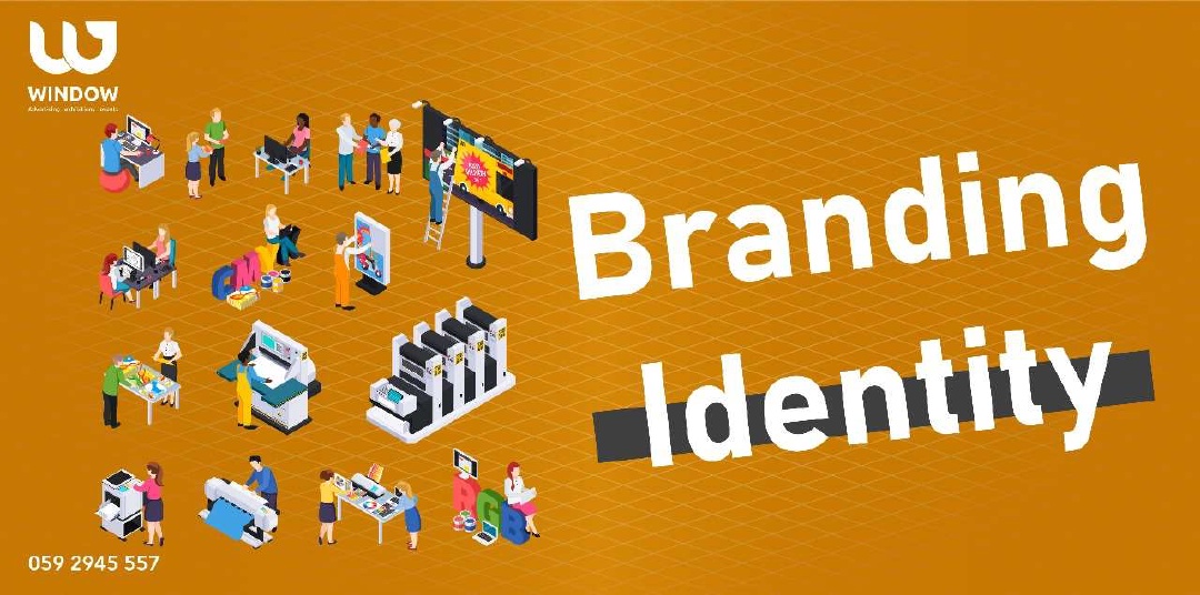
Brand identity is not a logo. It is not a color palette chosen from a design template. Brand identity is the complete visual and verbal system that defines how a business looks, speaks, and feels across every single touchpoint — from a billboard on King Fahd Road to a WhatsApp business message.
When a business invests in advertising before establishing this system, every campaign becomes an isolated event. The first campaign uses one set of colors, the second uses a different font, the third introduces a new tagline. The audience never connects these scattered messages into a coherent brand image. The money spent on each campaign evaporates the moment the campaign ends because nothing links it to the next.
Identity-first brands operate differently. Every advertisement, every printed brochure, every social media post reinforces the same visual and verbal language. Each campaign builds on the previous one. Recognition compounds over months and years until the brand becomes instantly identifiable — even without showing its logo.
Industry Insight: Studies show that consistent brand presentation across all platforms increases revenue by up to 23%. Brands that establish identity before advertising see significantly higher recall rates and customer loyalty compared to those that advertise without a unified identity system.
The identity-first approach does not mean delaying advertising indefinitely. It means investing the necessary time — typically four to eight weeks — to build the strategic foundation that makes every future advertising dirham work harder and last longer.
One of the most damaging patterns in the Saudi advertising market is the habit of choosing agencies based purely on the lowest price. A business needs a campaign, so it gets quotes from five agencies and picks the cheapest. Six months later, it needs another campaign and repeats the process — often ending up with a completely different agency each time.
This approach creates a chain of consequences that silently destroys the brand from within:
| Problem Created | How It Damages Your Brand |
|---|---|
| Changing visual style every campaign | Audiences cannot form a stable mental picture of the brand, reducing recognition to near zero |
| Inconsistent color usage | Colors are among the strongest brand identifiers; changing them confuses customers and weakens recall |
| Unstable brand voice and tone | One campaign sounds corporate, the next casual, the third uses humor — the brand personality becomes unreadable |
| Unclear core message | Each agency interprets the brand differently, so the market never receives a clear, unified value proposition |
| No accumulated brand equity | Every campaign starts from scratch instead of building on previous visibility, wasting every previous investment |
| Higher long-term costs | The money "saved" per campaign is multiplied in losses from repeated redesigns, brand confusion, and missed opportunities |
The Hidden Cost: A business that spends SAR 15,000 per campaign across four different agencies in a year (SAR 60,000 total) often achieves less brand recognition than a business that spends SAR 50,000 with one agency that maintains visual consistency. The cheapest price per project becomes the most expensive strategy over time.
Choosing an agency partner should be treated like choosing a long-term business relationship, not a one-time transaction. The right agency understands your brand deeply and ensures every piece of work strengthens the same identity — creating compound returns on your marketing investment.
Visual inconsistency is one of the hardest problems for business owners to detect because its damage is gradual and invisible. No single inconsistent campaign feels catastrophic. But the cumulative effect over twelve or twenty-four months can make a brand virtually unrecognizable to its own target market.
Every time a customer encounters your brand, their brain creates or reinforces a mental association. When your logo appears consistently in the same colors, with the same fonts, in the same visual style, these associations strengthen. The brand becomes a clear, stable image in the customer's mind.
But when each encounter looks different — different colors on the website versus the business card, a different style on social media versus the storefront sign — the brain cannot form a stable association. Instead of one strong brand image, the customer has multiple conflicting impressions that cancel each other out.
The Test: Take all your current marketing materials — business cards, brochures, website screenshots, social media posts, signage photos — and spread them on a table. If a stranger cannot immediately tell they all belong to the same brand, your visual identity has a consistency problem that is actively costing you customers and revenue.
Think of the most powerful brands in the world. You can identify many of them from a single color, a specific font style, or even the shape of their packaging — without seeing their name or logo. This is not an accident. It is the result of disciplined visual continuity maintained over years and decades.
Continuity works because of how human memory functions. The brain builds recognition through repeated, consistent exposure. Every time you see the same visual elements together, the neural pathways associated with that brand strengthen. After enough repetitions, recognition becomes automatic and effortless.
| Brand Element | Role in Recognition | Impact of Inconsistency |
|---|---|---|
| Primary color palette | Creates the fastest, most emotional brand association in the viewer's mind | Changing colors resets brand recall to zero and confuses loyal customers |
| Typography system | Establishes brand personality — whether modern, traditional, bold, or elegant | Mixing fonts makes the brand feel fragmented and amateurish |
| Logo and mark | Serves as the anchor point that ties all visual elements together | Frequent logo changes destroy the single most recognizable brand asset |
| Visual language and imagery | Defines the photographic and illustrative style that feels uniquely "yours" | Style inconsistency makes campaigns feel like they belong to different companies |
| Tone of voice | Creates a verbal personality that audiences connect with emotionally | Shifting tone prevents audiences from forming a personal relationship with the brand |
Recognition Fact: Research in brand psychology shows that it takes between 5 and 7 consistent brand impressions before a consumer can recall a brand from memory. Every inconsistent impression resets this counter, meaning brands without continuity may never achieve true recognition — regardless of how much they spend on advertising.
This is why identity must come first. The brand guidelines document — specifying exact colors, fonts, spacing, imagery style, and tone of voice — is the blueprint that ensures continuity across every future campaign, every new agency relationship, and every marketing channel.
While this article emphasizes the critical importance of building identity before advertising, it is equally important to state a fundamental truth: no business can succeed on identity alone. A beautiful brand identity that nobody sees is worthless. Advertising is the engine that carries your identity to the market, generates awareness, drives traffic, and converts prospects into customers.
The relationship between identity and advertising is symbiotic. Identity gives advertising its power — consistency, recognition, and trust. Advertising gives identity its reach — visibility, frequency, and market penetration. Neither works without the other.
The Rule: Identity without advertising is invisible. Advertising without identity is forgettable. The brands that never disappear are the ones that build identity first and then advertise relentlessly with absolute visual and verbal consistency.
At Window Advertising Agency, the principle of identity-before-advertising is not a marketing theory — it is the operational standard that has guided our work for over 25 years across Riyadh, Jeddah, and the entire Saudi market. Every client engagement begins with identity assessment, regardless of whether the client initially requested a single banner or a full campaign.
Window's integrated process ensures that no advertising investment is wasted on campaigns that fail to build lasting brand equity:
25+ Years of Results: Window Advertising Agency has helped hundreds of businesses across Saudi Arabia build identities that withstand market changes, leadership transitions, and competitive pressure. Our clients maintain recognizable brands because every advertising execution — from the first campaign to the fiftieth — reinforces the same strategic identity foundation.
Every time a business chooses an agency based solely on the lowest quote, it makes a trade: short-term savings in exchange for long-term brand damage. This trade seems rational in the moment — the campaign still gets produced, the brochures still get printed, the social media posts still go live. But the hidden cost accumulates quietly until it becomes impossible to ignore.
| Short-Term "Saving" | Long-Term Cost |
|---|---|
| SAR 3,000 saved on a campaign | Brand recognition reset, requiring SAR 20,000+ in future campaigns to rebuild awareness |
| Skipping brand guidelines | Every future designer and agency must guess your brand standards, creating compounding inconsistency |
| Using a different agency each time | No agency develops deep brand understanding, so every project starts from zero — wasting time and money |
| Accepting lower-quality design | Unprofessional materials damage credibility with clients, partners, and prospects who judge quality at first glance |
| Rushing identity development | A shallow identity requires frequent revisions and eventual full redesign — costing three to five times the original investment |
The Calculation: If your brand exists for 10 years and you change agencies or visual direction every 6 months, you will have presented 20 different "versions" of your brand to the market. No audience can build loyalty to a brand that reinvents itself 20 times. The cumulative cost of this inconsistency — in lost customers, missed recognition, and wasted campaigns — dwarfs any per-project savings.
The brands that dominate their markets in Saudi Arabia and globally are the ones that made the decision early to invest in identity and consistency. They understood that a temporary discount on today's campaign is not worth sacrificing the compounding brand equity that creates lasting competitive advantage.
Whether you are launching a new business or realizing that your existing brand lacks a cohesive identity, the path forward is clear and actionable. The following roadmap outlines the essential steps to build a brand that never disappears:
Window's Promise: This is exactly the process Window Advertising Agency follows with every client. Whether you need a complete brand identity built from scratch or a strategic overhaul of an inconsistent existing brand, our 25+ years of experience ensure that every step is executed with precision — and every advertising dirham that follows delivers maximum, lasting impact.
Ready to Build a Brand That Never Disappears?
Stop wasting advertising budgets on campaigns that vanish. Let Window Advertising Agency build your identity foundation first — then execute advertising that compounds recognition for years to come. With 25+ years of experience across Saudi Arabia, we turn brands into landmarks.
Start Your Brand Identity Journey
Brand identity is the foundation that makes all advertising consistent and recognizable. Without a defined visual identity — including logo, colors, fonts, and tone of voice — every ad campaign starts from scratch, confuses audiences, and wastes budget. Identity-first brands build cumulative recognition that compounds over time, making every future campaign more effective than the last.
Constantly switching to the cheapest agency leads to inconsistent visual styles, changing color palettes, unstable brand voice, and unclear messaging. Each new agency reinvents the wheel, and the brand never builds lasting recognition. The money saved on price is lost many times over in wasted brand equity and campaigns that fail to compound.
Visual inconsistency prevents audiences from recognizing your brand across different touchpoints. When colors, fonts, and design language change frequently, customers cannot form a stable mental image of your brand. This destroys trust, reduces recall, and forces you to re-introduce your brand with every campaign — essentially restarting from zero each time.
No. Even the strongest brand identity needs advertising to reach audiences, generate awareness, and drive conversions. Identity without advertising is invisible. The key is to build the identity first, then advertise strategically so every campaign reinforces and compounds the brand's presence in the market.
Window's integrated approach starts with building a complete brand identity — logo, color system, typography, tone of voice, and brand guidelines. Only then does the team execute advertising across print, digital, signage, and events. This ensures every piece of communication strengthens the same brand image, backed by 25+ years of experience in the Saudi market.
A comprehensive brand identity typically takes 4 to 8 weeks to develop properly, including research, strategy, design exploration, refinement, and final guidelines documentation. Rushing the process leads to shallow identities that need frequent revisions — costing more in the long run than doing it right the first time.
Continuity is the secret. Strong brands use the same color palette, typography, and visual language consistently across every touchpoint for years. This repetition builds deep neural associations in consumers' minds, so they can identify the brand from a single color or font style without even seeing the logo. It takes 5 to 7 consistent impressions before a consumer can recall a brand from memory.